Fuzzy Math
fm_logo
AI+UX
Services
UX Design Services
AI Integration UX Design
Digital Product Strategy
Digital Transformation
UI/UX Design
UX Research
Org & Team Services
UX Organization Design
UX Training and Hiring
Work
Our Work
Case Studies
Clients
Industries
Enterprise
Business Applications (B2B)
Financial Services
SaaS
Healthcare
Nonprofit
Insights
Resources & Insights
Blog
Newsletter
All Resources
Featured
UX Leadership by Design Podcast
UX Glossary
About
Careers
Internships
Get in Touch
Blog
Blog
Advice and insight from the UX experts at Fuzzy Math
Fuzzy Math 2023 WRAPPED!
Posted by
Dylan Drooger
Past Posts
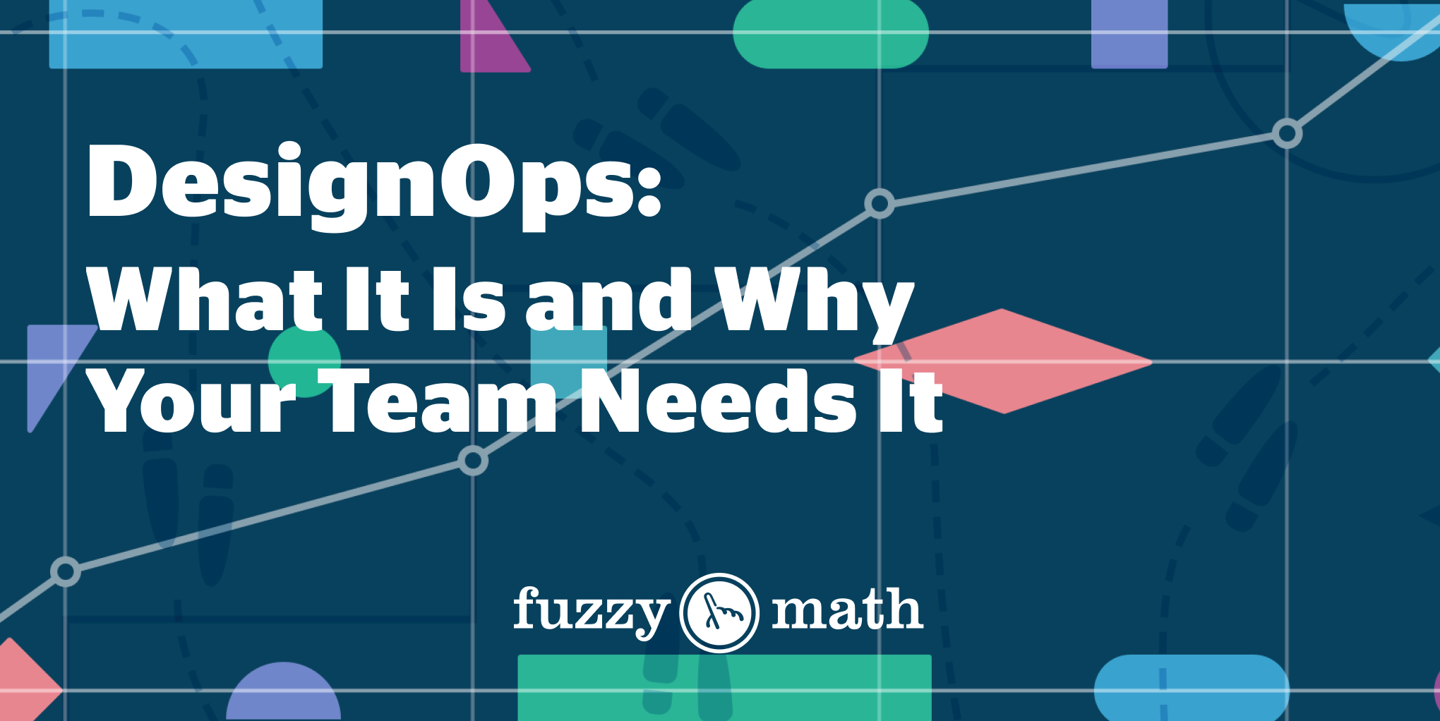
DesignOps – What is it, and why your design team needs it
Posted by Mia Villarreal
AI & FM: Integrating AI Into Your Workflow
Posted by Alli Sevareid
The Challenges of Designing for Data Security
Posted by Kelly Cunningham
UX Storyboarding as a Unifying Force
Posted by Ellie Lee
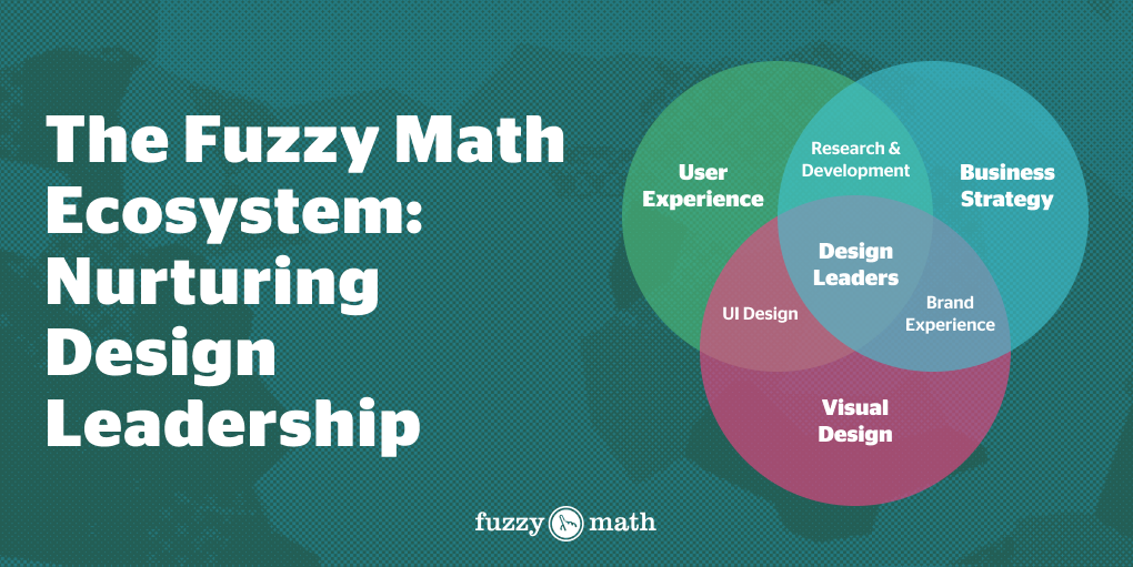
The Fuzzy Math ‘Ecosystem’: Nurturing Design Leadership
Posted by Dylan Drooger
Design System Template: A New Direction in Fuzzy Math’s Design Process
Posted by Tré Wilson
The Color Palettes of Mental Healthcare UI
Posted by Tré Wilson
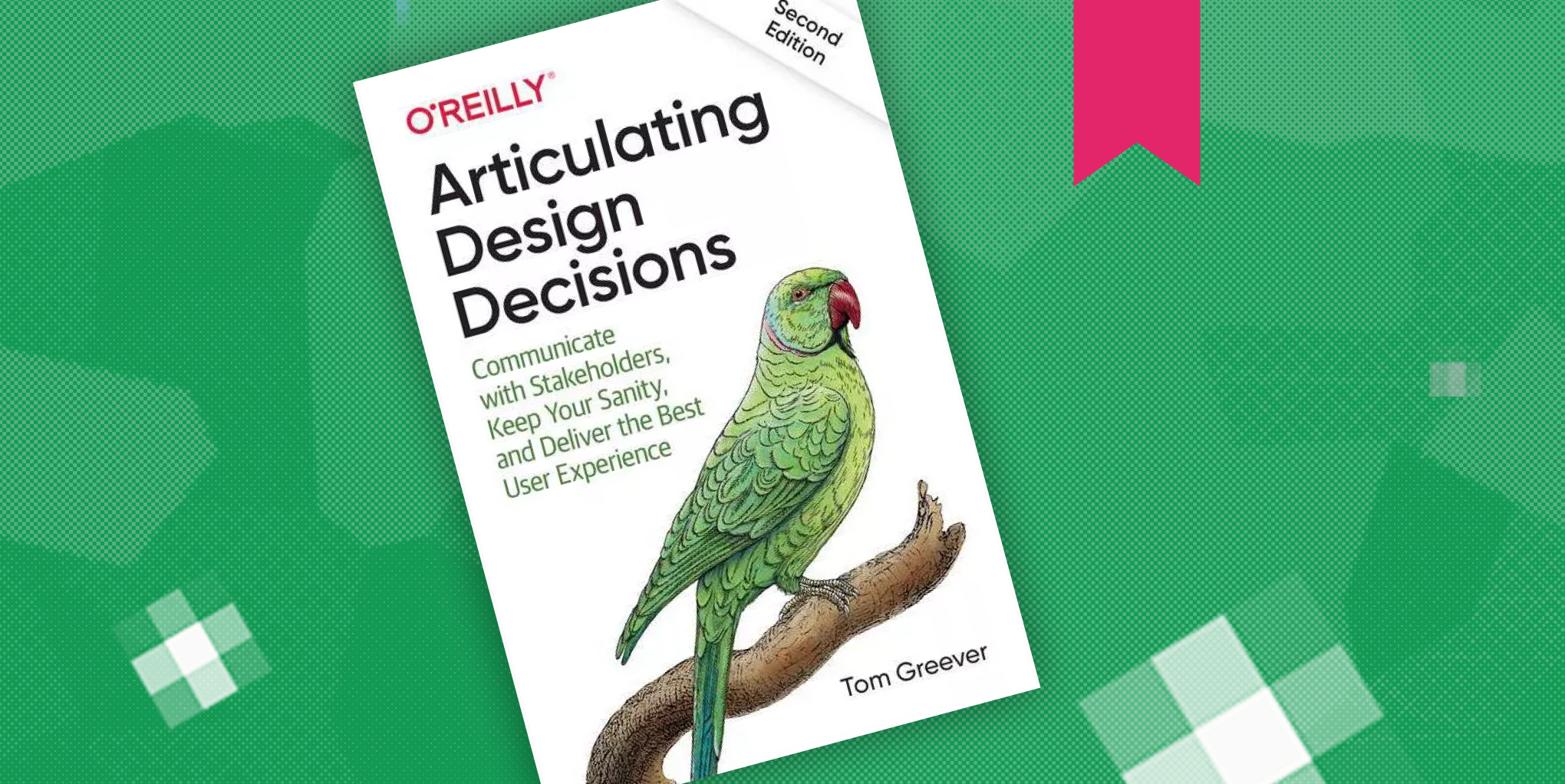
Fuzzy Math Book Club!
Articulating Design Decisions
Posted by Abbie Kmiec
Meet the Fuzzy Math 2023 Interns!
Posted by Fuzzy Math
1
2
3
…
33
→
1
2
3
…
33
→
envelope
mail-envelope-closed
file_pdf
arrow-up
chevron-left
arrow-left
close
x
linkedin
twitter
facebook
mailbox
search