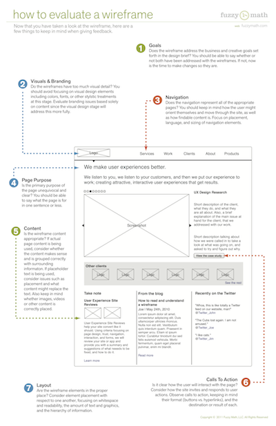
Next up in our wireframe basics series – we’re focusing on evaluating wireframes and wireframe reviews. Evaluating a wireframe is another crucial piece of the wireframe puzzle, for both designer and client, so the gang at Fuzzy Math put together another how-to guide. The first step was understanding the parts that make up a wireframe, now it’s time to figure out what all of those pieces are collectively saying, and how well they are saying it.
Evaluating a Wireframe
With the wireframe in hand or staring back at you from the computer screen, it’s time to review it and give some solid feedback. Constructive feedback ensures both designer and client continue to move forward through the design process and effectively solve the problems at hand. Below are a few of the main talking points to keep in mind when reviewing a wireframe:

1. Goals
Does the wireframe address the business and creative goals set forth in the design brief? You should be able to say whether not both have been addressed with the wireframes. If not, now is the time to make changes so they are.
2. Visuals and Branding
Do the wireframes have too much visual detail? You should avoid focusing on visual design elements including colors, fonts, or other stylistic treatments at this stage. Evaluate branding issues based solely on content since the visual design stage will address visuals more fully.
3. Navigation
Does the navigation represent all of the appropriate pages? You should keep in mind how the user might orient themselves and move through the site, as well as how findable the content is. Focus on placement, language, and sizing of navigation elements.
While navigation should certainly be addressed during the wireframe review, this should not be the first time you discuss the information architecture of your end product. Site maps and process flows are both crucial steps in understanding how a site is structured and how a user might move through the site. These deliverables should be reviewed before wireframes are started.
4. Page Purpose
Is the primary purpose of the page unequivocal and clear? You should be able to say what the page is for in one sentence or less.
5. Content
Is the wireframe content appropriate? If actual page content is being used, consider whether the content makes sense and is grouped correctly with surrounding information. If placeholder text is being used, consider issues such as placement and what content might replace the text. Also keep in mind whether images, videos or other content is correctly placed.
6. Calls to Action (CTAs)
Is it clear how the user will interact with the page? Consider how the site invites and responds to user actions. Observe calls to action, keeping in mind their format (buttons vs. hyperlinks), and the destination or result of each.
7. Layout
Are the wireframe elements in the proper place? Consider element placement with respect to one another, focusing on whitespace and readability, the amount of text and graphics, and the hierarchy of information.
Why are wireframes an important part of UX design?
Wireframes are often the first step towards a final UI of your product. They give the entire team a chance to align on the process and structure of a design that previously only existed in someone’s head.
Because they are the first UI artifacts produced for a product, wireframes allow for clarification of features that may be complex, “designer-y,” or not well understood by the entire team. During your wireframe review, align on what you mean by “reports” or a “card view” before you get too far down the rabbit hole.
We like to tell clients that wireframes are purposefully “ugly,” or at least black and white. By stripping out the visual design like color, fonts, and images, we can use low-fidelity wireframes to align on layout, goals, and content of a page. Don’t get caught in an argument about whether or not someone likes the color green. That’s a conversation for another day.
Wireframes are a relatively quick (and therefore cheap) way to get an idea out of designers’ heads and into existence. Sharing designs at this stage allows changes to be made more easily, saving clients time and money down the road. In many cases, we also recommend testing your product in the wireframe phase. Once you have 50 pages designed and you’ve spent hundreds of hours on visual designs, it becomes more and more time consuming to go back and make a huge structural change. Align on broad strokes during the wireframe phase and the wireframe review to keep your project on time and on budget.
•••
Next up in the wireframe series: How to design a wireframe