For anyone who’s ever wanted to check our member bios during a meeting, or review some of our client projects after meeting one of us at an event – now you can (and far more easily than before)! We entirely revamped our previous mobile site, encapsulating most of our full website into an entirely new website targeting mobile devices. Interested in how we design for mobile? Keep reading!
Design Process
Like most projects at Fuzzy Math, we started with a Kickoff meeting. Here, we looked at examples of comparable sites, checked out the IA of our full site, and decided on a design direction and the content we wanted to pull in to the mobile site. We debated between creating a responsive version of our primary website and creating a mobile-first website, and decided on the latter since it gave us a better opportunity to hone in on the specific content needs of mobile users.

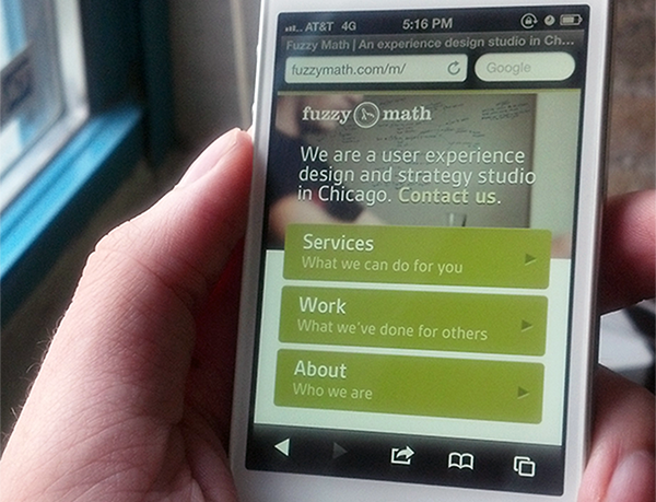
As with any mobile site we design, our focus was on identifying the key content that mobile users would be interested in and narrowing the site architecture to that content. Given the likely times people would be accessing our site from their phone – in meetings, at events, and when coming to our office – we wanted to emphasize what we do (Services and Work), who we are (About), and how to find us (Contact). Other sections of our full site which were seen as less relevant to mobile users are left out, or consolidated within other pages, to reduce clutter, save space, and ensure a clear focus.
After evaluating a few different interface directions, and quickly trying a few out in wireframes, we decided to proceed with a landing page approach. This approach allows for the initial page to load quickly and give a bit more context about the content within – what pages are there, and what’s within each. We also use the visual design to reinforce this relationship. By bringing in similar fonts and layout principles, as well as an image, visitors are reminded that the landing page effectively serves as a home screen of the full site.
Attention to details is important. On a mobile device, the look and feel helps convey the potential interaction with the content. Simple questions help us decide where we need to adjust the visuals. Where are the interactive elements? How much depth is needed to convey these as links or buttons? What kind of feedback should we give so the visitor feels the interaction is harmonious with the look? Both on the home as well as interior pages, this sensitivity to visitors’ needs helps guide us to make efficient visuals that also add small elements of harmony and delight.
Once on an interior page, other pages are available from a full-width top nav, which went through rigorous testing to ensure each button was easy to tap. Testing also supported the visual hierarchy and spacing of interior pages to provide legibility and interest. An underlying, narrow, horizontal grid provides unity for highlighted content and indented text and buttons.

While the wireframes and initial visual design gave us a great starting point, mobile design requires a bit more of a hands-on approach. We took the wireframes into HTML using the fantastic HTML5 Mobile Boilerplate and began quickly iterating through prototypes, testing at different resolutions and then testing on various phones to see how it displays and evaluate the interactivity and visuals. By prototyping in HTML we were able to rapidly adjust sizes to find a scale that fit nicely across various common device resolutions. We also noted that color profiling changes by device and device browser, so very subtle color shifts were taken into account.

Once we had a layout we liked and a visual direction, we finalized the look and feel then built out the fully designed site. More iterating and a lot more testing later, and v1.0 is live! We hope it helps visitors, friends, and potential new friends to interact with our site while on their mobile device.
Check it out and let us know what you think!