Visual Communication with IA
The first project I worked on at Fuzzy Math (FM) was one in which we were tasked with redesigning the navigation system and taxonomy for a client’s travel-related website . When people hear “redesign”, it’s likely their mind will jump to some kind of screen or interface designs. However, we were faced with the unique challenge of not designing screens for this project – so rather than calling it a navigation redesign, it would be more accurate to say the project was about reorganizing and restructuring the navigation, and creating a recommendation for how the content should be grouped throughout the site.
When people hear “redesign”, it’s likely their mind will jump to some kind of screen or interface designs. However, we were faced with the unique challenge of not designing screens for this project.
One common misconception of user experience (UX) designers is that we’re “those people that create wireframes.” We do create wireframes, but that’s a relatively small part of a much larger and more complex process of research, consolidation, understanding, communication, and validation.
As UX designers, one of the biggest parts of our job is to communicate our ideas effectively. In the screen design stages of our projects, we use wireframes as a communication tool to help clients understand and visualize our recommendations before investing too deeply into visual design or implementations.
As UX designers, one of the biggest parts of our job is to communicate our ideas effectively.
For this project, we were tasked with making navigation recommendations without showing screen designs. Our approach to this involved several rounds of research – first, we used surveys to find out how users prefer to navigate and find trips on a travel website, taking their level of flexibility on dates and destinations into account. Second, we conducted a card sort to determine users’ taxonomy expectations for how content should be grouped on the site. We combined these two sets of research to determine which content should be used in search behavior or filtering, and which content that should be used as part of the main navigation and other browse behavior on specific pages.
Without wireframes, we faced several challenges around communication. It was difficult for us to use these documents to help our client understand the meaning without getting into very specific discussion of UI (user interface) implications and behavior, the answers to which we hadn’t been able to consider yet. Additionally, we had a disconnect in the way we were thinking and talking about taxonomy and affordance – the difference between the information architecture and the interface was often blurred and unclear.
Because humans are visual creatures, it’s much easier to communicate using a visual aid than to explain an idea using only words (does anyone really enjoy reading business requirement documentation?). During the course of the project, it felt at times as though we were restricted in our communication abilities by being unable to use wireframes as a tool for discussing our concepts and helping the client understand our recommendations. We even had some challenges communicating internally, too – after getting so deep in the trenches with these documents, the only way to further explain what we meant to each other was to do a quick sketch.
The Value of Putting IA First
However, the fact that we weren’t doing screen designs didn’t mean we were locked out of all visual aids as means of communication. We delivered a set of documents that included taxonomy and site maps, among other detailed explanations and diagrams for how users would navigate between pages on the site. Building and iterating through many taxonomies and navigation concepts that came out of the research helped us set a clear pathway for how screens could be designed in the future, without focusing on the specifics of UI interaction and layout.
Just because we weren’t doing screen design didn’t mean we were locked out of all visual aids as means of communication.
The deliverables we created had not only helped us build on our navigation and taxonomy concepts, but also set us up for screen design by adhering to the separation of what needs to be on the page from where and how it needs to be on the page.
Here’s a breakdown of our deliverables, and the insight each gave us for future UI considerations:
- Taxonomy – Our research results from the card sort gave us insight into how the content should be grouped. Some of our survey questions gave us insight into how users would prefer to prioritize certain filters and navigation behaviors. These helped inform what should be in the global navigation, how content should be grouped within a particular section or category, and how users expect different filtering and tagging options to be grouped and prioritized.
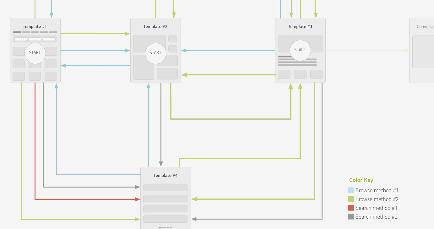
- Page flow & templates – Allowed us to picture how users would navigate from page type to page type, giving us a high-level vision of what elements would be necessary on each template (links, search elements)
- Tag behavior documentation – We used this to explain how people navigate throughout the site by using tags. This allowed us to picture some of the page elements that could be used as cross-category navigation and/or featured content on certain pages.
All things considered, the opportunity we had with this project to focus solely on information architecture was a unique one. Despite not using screen design, we still communicated our ideas with visual aids to help the client understand the flow of heavy data throughout the site. Because of the deep-in-the-trenches thought that came along with those deliverables, we firmly believe that this heavy up-front focus on research-based IA can only help in creating solid UI design for this and future projects.