Interaction design is at the core of what we do at Fuzzy Math every day. One fundamental challenge of it, though, lies in presenting the interaction (the intended effect of a user’s action within the experience) itself. Many factors influence how we present an interaction to our clients. In this post, we’ll break down one model that demonstrates how we approach this presentation problem, and we’ll highlight a few examples to show how it can be applied according to the scenario at hand.
In any scenario, and with all our clients, we practice a user-centered design process so we can learn about and advocate for user goals and needs. We turn the insights we hear from end users during research into interfaces informed directly by users. Throughout our process, we rely on many tools and techniques for design and presentation of the interactions we intend within an experience. Among these are a handful of options located along what we’re calling the “interaction spectrum” that allow us to show our clients and their users our ideas for interaction within their tool.
The “Interaction Spectrum”
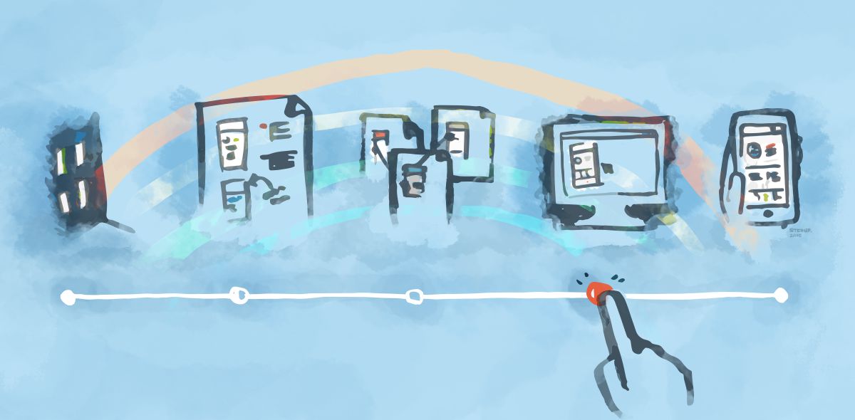
One way to think of the presentation of interaction is to consider a “spectrum” from static to entirely interactive. This helps accommodate the many levels of interaction that can be demonstrated with many interface design tools (including code) while also suggesting a certain fit for different factors.
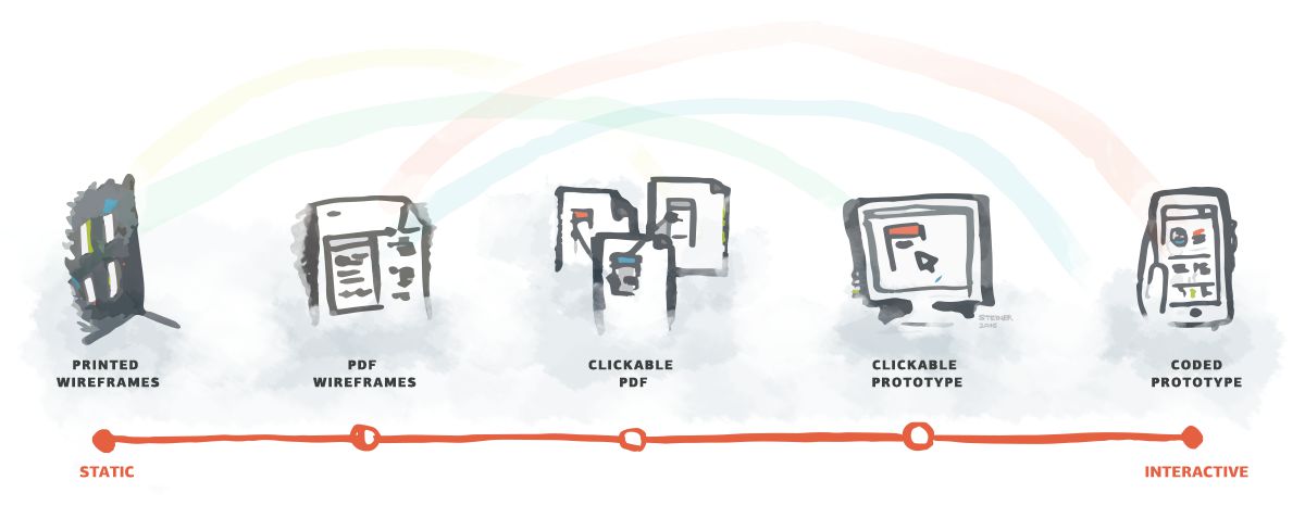
At one end of the spectrum, you have a totally static deliverable that presents a user interaction, such as a PDF wireframe printed out and taped to a wall. There’s no attempt to mimic the final experience – no scrolling nor movement. It’s essentially a description of the interaction. At the other end of the spectrum, consider a completely real experience. This is typically a digital product where someone can interact as if they were the actual user. They can click, hover, and interact with all the elements on the page. Here is an example of how that spectrum might be segmented based on different deliverables.
Keeping in mind that each deliverable has a time and place for use, let’s just take a look at the strengths and weaknesses of each end of the spectrum to provide an idea about how we might assess what’s appropriate for a given project.
Static
Strengths
- Prioritizing information design and layout
- Demonstrating simple scrolling vs. complex interactions
- Showing all potential states (when there’s time)
- Easily supporting varying levels of fidelity
Weaknesses
- Difficult to convey how elements will work using flat images
- Tricky to envision the whole experience
- Can create more “What happens if…” questions
- Conveying interactions with data and navigation through a system
- Only necessary states are shown (when time is limited)
Interactive
Strengths
- Can show actions that are tied to scrolling
- Clarity of showing over telling
- Demonstrating transitions and pacing
- Get a feel for the real experience
- “What happens if…” questions become “It’s really cool when…” reactions
- Easily supporting varying levels of fidelity
Weaknesses
- Connected screens aren’t always linked
- Hard to tell what’s clickable vs. what isn’t, depending on fidelity
- Requires more time as complexity increases
- Can create confusion or questions about un-prototyped areas
A Few Examples
With the strengths and weaknesses of the interaction spectrum outlined above, let’s take a look at some example project types where we might apply them.
Interaction Concepts

Concepts, by their nature, are just ideas. Presenting interaction concepts spans the entire spectrum. A well-suited presentation of interaction really depends on knowing the audience and understanding how much time is available. HTML prototype of an interaction might make sense if content and hierarchy are all approved. Simple wireframe showing states might be equally as effective if time or resources are short. Even better, just sketch up a paper prototype of the interaction if possible.
Data Dashboards

Dashboards are generally focused on presenting summaries of data in a clear, concise manner. Usually limited interaction is needed to demonstrate the design – often there are a few links off to more detailed information or other areas of the application. Prioritizing decisions on information hierarchy and layout is critical for an effective dashboard, which means that staying on the static side of the spectrum is generally going to be ok.
Mobile Web/Applications

Experiences in a handheld environment bring many unique expectations for interaction. Users may expect to tap, swipe, or shake to interact. This means the context for the interaction holds more weight for the end experience so starting with a prototype is often smart. Additionally, less information on a screen and a focus on the sequence of a user’s actions further suggests possibly starting with interactive prototypes.
Complex Platforms
The more environments and elements within an experience, the more careful our consideration is when presenting interaction. Things like content, information hierarchy, and the relationship of elements within the platform are important to get right early on. Also, many complex ecosystems have legacy interactions and many interconnected pieces that have to be considered. This is why presenting interaction design for a complex system can involve both ends of the spectrum above at different phases in the design process. How an interaction is presented depends on phase in the process (earlier typically involves more rough presentation such as paper-prototyping), targeted user flow, and number of elements affected by the interaction, among others). Usually we start on the static end of the spectrum and progressively dip toward presenting the “real” interactivity as the project moves along.
The Fuzzy Math of Interaction
In all cases, the way interaction is presented boils down to the sum of the other decisions that need to be made before interaction is fully baked. While it’s debatable which factors affect how you present interaction, we find time, complexity, and priority of the decision at hand to be the most important. Prioritization is at the core of the design process, and deliverables are fundamentally about prioritizing decisions. Whether static wireframes or interactive, the goal should always be having just the right amount of detail needed to make the decision at hand.